Google’s latest redesign sparked a debate over prioritizing aesthetics vs. usability.
In this project, I attempted to rethink how Google’s icons could leverage their old look while sporting a refreshing look consistent with Google’s latest design language.
The main challenge of this project was to keep Google’s new colour palette while creating a new set of easily recognizable and distinct icons, prioritizing usability over aesthetics.
The Problem
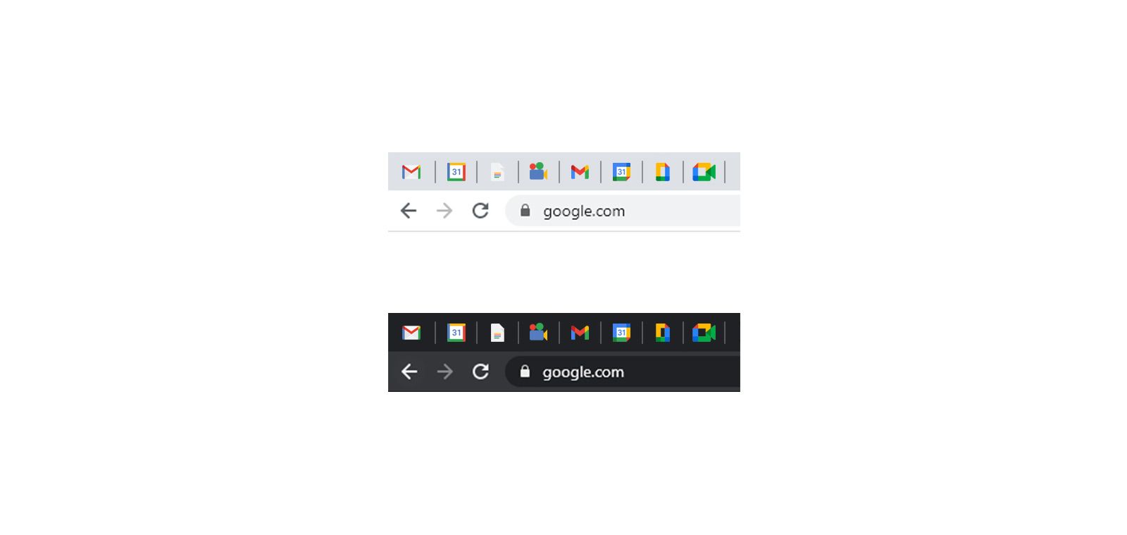
In Google’s latest update, the Californian company chose to unify its visual look through its four brand colours: Blue, Red, Yellow, Green. While Google’s intent was to create a cohesive suite of icons for its new ‘Workspace’ product, the execution was for many, underwhelming. As I researched Google’s average user profile, I confirmed my beliefs that most of Google users interact with its services on either their smartphone or internet browser. Furthermore, I discovered that the average number of opened browser tabs for a single user is between 10 and 20—if not more! As I gathered feedback from friends and colleagues, it became clear to me that Google’s icons had never been reminders of Google’s brand, but instead, they served an important function: visual cues inside a chaotic row of tabs.
Reflecting on the Problem
As users interact with their phone, they become accustomed to the look and layout of their icons. On iPhone, users that wish to communicate with someone, will be looking for a green icon (i.e. Phone, Messages, Facetime). Alternatively, if they seek to use a utility app, they will likely be looking for a grey icon (i.e. Camera, Settings, Calculator).
In the field of cognitive neuroscience, we call this concept pattern recognition. Pattern recognition is the process of retrieving a long-term memory (e.g., memory of the iPhone messages icon) based on a stimulus (e.g., visual representation of the iPhone messages icon). We recognize dozens of patterns every day. From traffic lights to our smartphone home screens, we become habituated to specific patterns that have become quick and easy for us to recognize.
We are coded to contrast icons based on their differences in colour and shape. As we introduce new icons in our daily lives, our brain has to encode this information into our semantic memory for retrieval later on. This allows for swift retrieval later, which becomes extremely beneficial for productivity.
In the case of Google’s new redesign, the concept of pattern recognition was forgone. Feedback from many users highlighted one critical issue: users rely on the icons’ shape and colour to easily differentiate one tab from one another.
Now homogenous, Google’s new icons are no longer easily recognizable. Their new shape and colours make swift pattern recognition difficult for many, subsequently threatening productivity.
The Solution
To bridge the gap between Google’s new redesign and its usability, I had to think of a solution.
Howbeit a simple one, the redesign required that I meticulously select the parts reminiscent of Google’s old design and blend them with the new design in a way that would make it quick and easy for most users to recognize and differentiate them.
Behind the Thinking
Gmail
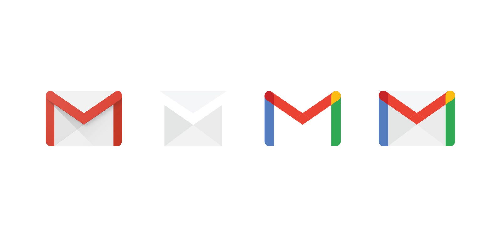
For the Gmail icon, I chose to keep the famous red-bordered white envelope most users are used to. I reshaped the envelope to be simpler and more symmetric, removing the old pseudo-reflective shadow effect of the old envelope. Since the red colour was so prominent with the old icon, I maintained it for the slip and added the blue and green colours to each side, blending into dark red and yellow at the junctions.
With these adjustments, the icon retains its former shape and outline while having a refreshing look on both the envelope and the ‘M’ shaped slip.
Docs
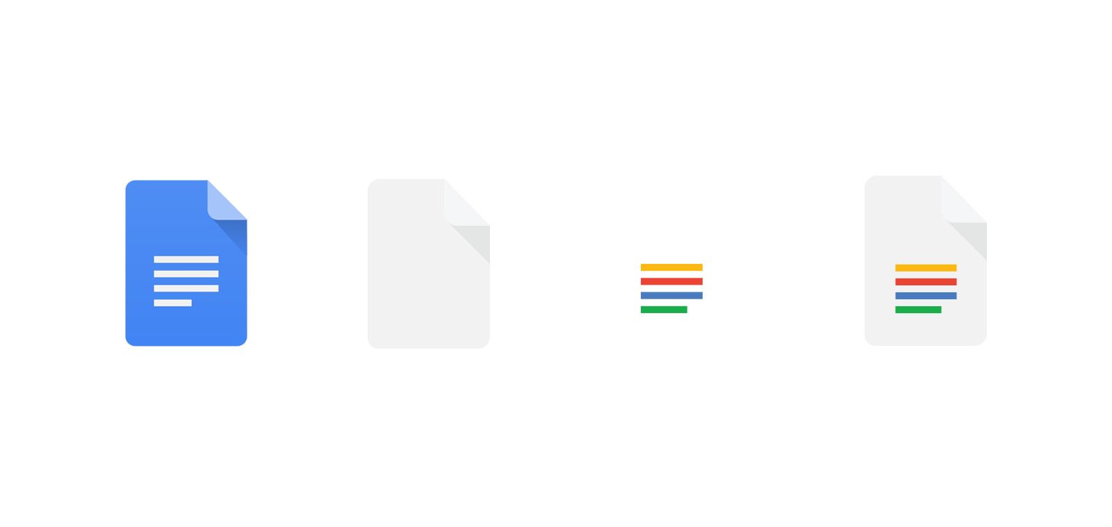
The Docs icon was one of the less challenging ones to do. Other than the blue of the original icon, the outline of it did not look so much dated. The gist of it was maintained, keeping the elongated shadow of the fold and then colouring the four lines to Google’s new colours.
Alternative icons were explored, such as adding a picture icon above the lines, adding bullet points before the lines. However, those changes clustered the icon and made the icon less distinguishable when reduced to a favicon size.
Calendar
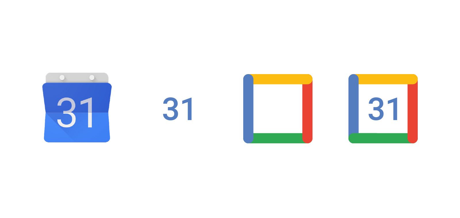
The Calendar icon proved to be a challenge when trying to blend the old with the new. The old Calendar icon had an old skeuomorphic-like look that was hard to refresh without significantly altering it. For this icon I decided to keep the old number look in the centre, but I changed the outline to one that resembled the newer Calendar icon. This combination of Google’s old and new Calendar icon created an icon that was both refreshing, yet slightly different.
Meet
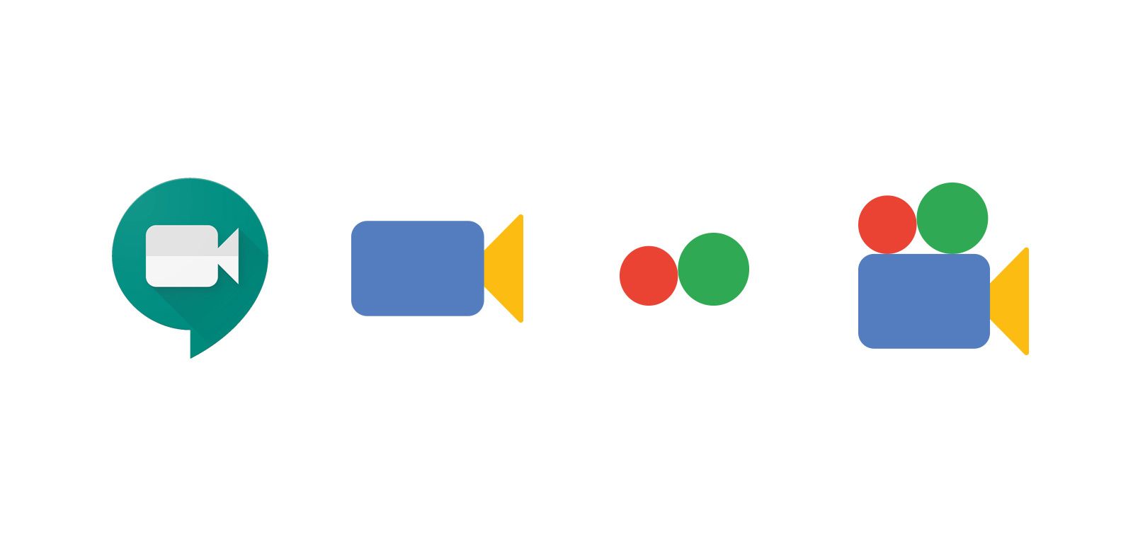
The Meet icon required a different thought process. While it would have been easy to make an outline akin to the Calendar icon and call it a day, it would have been too similar to the Calendar icon when viewed in a tab. I sought to create an icon that had all four of Google’s colours on four different components. Since the old icon only had a camera body and a lens, I had to figure out a way of adding two other components that would complement the icon.
Reflecting on the concept of Meet, I realized that while we record ourselves through our webcam, we also project ourselves on the other participants’ screen. Drawing from that, I decided to have two circles reminiscent of old-school projectors. This alternate shape now fits with the concept of Meet but also allows for four components that can individually be coloured.
The Takeaway
Google’s latest icon redesign, though refreshing, sparked an enormous debate on whether aesthetics should be prioritized over usability. As demonstrated by the findings above, a significant percentage of Google’s users rely extensively on favicons to get around their tabs. Unfortunately, Google’s recent design changes defeated this purpose and created dissatisfaction for many. The takeaway? Form often follows function. As designers, it is our duty to see beyond the design and understand the many impacts it may have. After all, designing around constraints can only expand our creativity!